We live in a visual world. People are judged on how they represent themselves. Businesses are also affected by the images they use to represent their company. That is why they put a lot of effort into marketing. A visual touchpoint is a key factor to successful marketing and the logo brand identity (BI) and corporate identity (CI), are powerful visual touchpoints. It is uncommon to change an established business logo, however a successful logo change can inject new life into an old brand.
Recently, Korea changed its official government identity symbol. The previous logo was similar to a hibiscus. However, in keeping with the existing symbols of Korea, and in order to promote the image of a unified government branch and association, the new logo will resemble the nation's Taegeuk circle of three colors.
Also, the Seoul Metropolitan Government developed a new brand for the city when it introduced the saying ‘I.Seoul.U’. It has been selected as the capital city's new slogan to replace its old-fashioned slogan "Hi Seoul” of last year. These changes imply the importance of logo design and their altered images.
Through the renewal and change of the logo, BI and CI, many companies are trying to change their old images in favor of new images. They hope to reflect the social trends and preferences of their customers by sustaining the intent of their original images. Then, why do they change their logo at all?
The start of designing a brand identity comes out of making a ‘logo’ which represents the image of a company or store. Logos are an essential aspect of business marketing, even in public organizations. According to marketing strategy, a well-designed logo is considered as an important factor for success. They display a company's unique identity through colors, fonts and images.
To learn more about the power and importance of a logo, The Dankook Herald (DKH) interviewed Oh Ah-yeong, a representative of BRANDIO, a popular logo and sign design company. The DKH asked about the influence of a logo on the public. ”Logos are the chief visual component showing a company's overall brand identity. People can see the logo on websites, business cards and advertising. Thus, a well-designed logo can lead to business success,” she replied.
Then the DKH asked what she is concerned with when making a logo. ”First, it is important to understand the client's requirement or needs. Continuous communication between the designer and clients is necessary. Second, a logo should show each business's unique identity. Every business has different traits and a different story to tell such as what they sell, how they treat their customers, why they run the business. These things should be implied in the selected concise fonts and images. Third, if the use of color is limited, the logo will have a very simple, but strong effect,” she said.
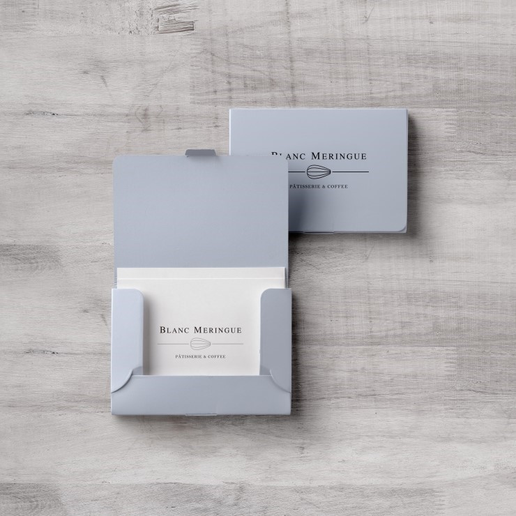 |
| ▲ This card represents the recent trends of logo. |
At last, the DKH asked about any recent trends in logos. “Recent trends are simple and tidy mono lined logos which do not use many colors, patterns and gradation. Calligraphy is also a trend,” she said.
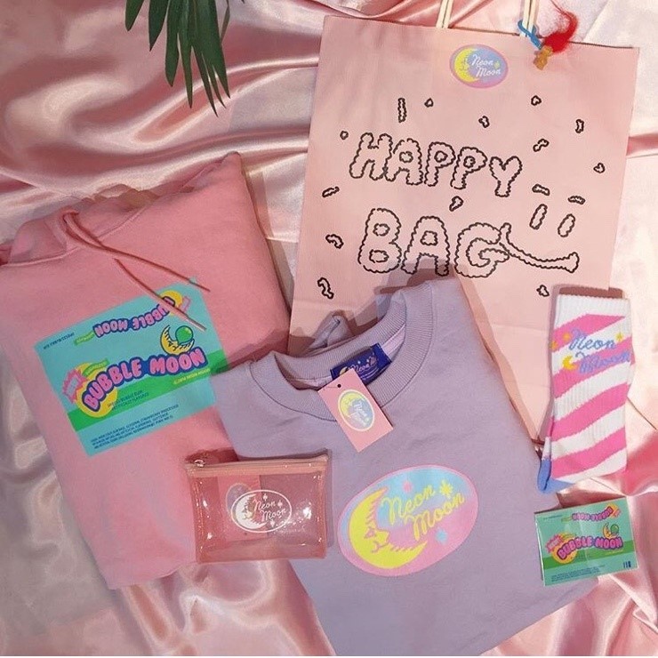 |
| ▲ Their own products are very popular in both online and offline. |
The DKH also interviewed the CEO ‘Lee So-young’ of ‘Neon Moon’ which is well known for its own neon sign logo and the unique items it sells in Yeonnamdong is a retro life style shop, capitalizing on the styles of the 70s and 80s in America. DKH asked about the meaning and features she thought of when designing her logo. “Neon Moon is just a combination of words I like and have a longing for. The main logo (the moon) was designed to show the mood of our store which targets 70s and 80s styles in America. I tried to use cursive script, which was often seen in the 70s-80s and used a drawing style from old movies. In case of their other logo (the unicorn), we made it when we designed our store with the unicorn concept. I also designed this logo to share a similar mood with our main logo,” she said. The DKH heard that Neon Moon was the first store made famous on Instagram using a neon logo. So the DKH asked how their logos effect to become a hot spot. “The start of our fame did not come from our neon logo, but rather as the shop became famous, the logo, which is the symbol of our store also became well known. To overcome the limitation that we sell only items like other stores, I decided to make the unique products for sale only in our stores such as clothes, pouches, and cell phone cases. And these limited items are more popular than other items,” she answered. “Actually, because of their popularity, these items which have their own logo have been copied a lot,” she later added.
Through this interview, the DKH learned the importance and power of the logo. However, there are a few exceptions, one of which was ‘MUJI’. MUJI is well known for good products which have no brand. Every product has no brand logo on them. It pursues a practicality, balanced with its surroundings, along with ease of use rather than extravagance, and conspicuousness. This firm philosophy of the brand makes us confident in the reliability of MUJI.
Another example is ‘No Brand’ by E-mart. As you can tell by the name, No Brand are a private brand product (PB product) that removes the brand name in order to lower the price. These products minimize packaging while sustaining the quality, for low price.
Of course, without logo, BI, and CI, the quality and merits of items should be prioritized first like they are with MUJI and No Brand. These are the rare cases when the influence of logos is ignored. Generally speaking, however, we can’t ignore a logo, BI and CI which give us a specific brand identity from its letter form, color, and design. Most logos of stores and companies have their own meaning. The DKH recommends you look at their logo closely to think about the images and features of these stores and companies.
허윤아, 최현기 dankookherald@gmail.com
![[Campus Magnifier] Let's Surf the Library!](/news/photo/202404/12496_1765_4143.jpg) [Campus Magnifier] Let's Surf the Library!
[Campus Magnifier] Let's Surf the Library!
![[Campus Magnifier] Let's Surf the Library!](/news/thumbnail/202404/12496_1765_4143_v150.jpg)